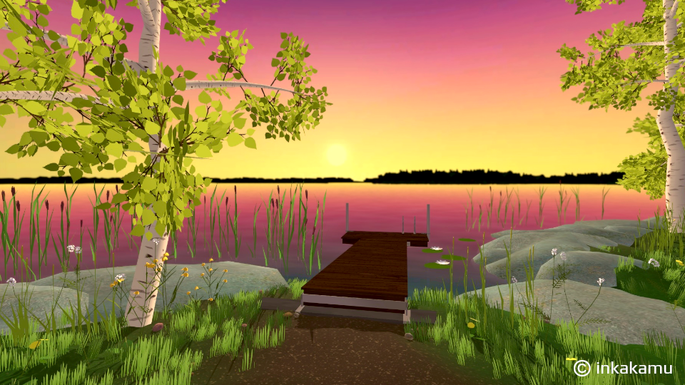
This month I’ve started to play around with the look of the game while importing my 3D assets into Unity. There’s been a lot of back and forth while trying to make decisions that will affect the style of individual elements, how light and shadows will behave and other post processing effects.
To help me create the style I wanted for the game I put together a mood board and a couple of quick concept art elements at the start of my game development journey one year ago. This though is far away from a step by step style guide, which is why I’ve been tweeking the look in Unity while still trying to figure out exactly what I want.
One element that has given me a small headache is water. I’ve definitely used more than enough time trying different solutions, sometimes aiming to align with my badly defined reference guide and sometimes getting lost adding details like foam, which doesn’t even fit with the look I’m after! It’s a perfect example of my wandering indecisive mind.
Because of this I’ve actually realised I need to take a few days break from Unity to put together a proper step-by-step style guide to describe the look of the elements and the rationale for them. This will help me complete my first version and move on. After all, I can always come back to tweek it.